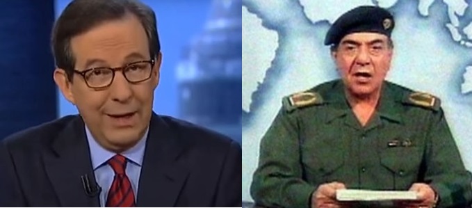
Propaganda: Wallace & Fauci Edition – Look At Graph and Listen Carefully to PRAVDAesque Presentation

Once you realize that COVID-19 is being pushed as a purposeful political control tool, it becomes easy to spot the propaganda as it is delivered. The statistics just do not match the expressed narrative. Small jumps are labeled “massive spikes.”
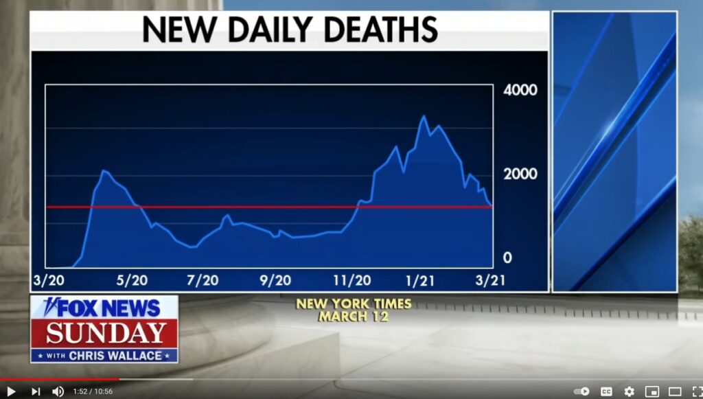
For an audio visual demonstration, watch this prompted segment from Fox News Sunday and the DC Swamp Gatekeeper Chris Wallace as he discusses narrated statistics of the virus. Compare what he is saying to the graph he displays to support what he is saying. They do not align. [Prompted to 01:44]
“And second, the number of deaths reported per day, which also is down sharply, but if you look at that horizontal line is still higher than it was during the very concerning spike last July.”
Um, what “very concerning spike last July“?
Matt Taibbi is correct, it’s not bias anymore; it is way beyond that.
– The Sovietization of the American Press (next DGM OP)


Post a Comment